ProjectsLanding page & dashboard
Orbita
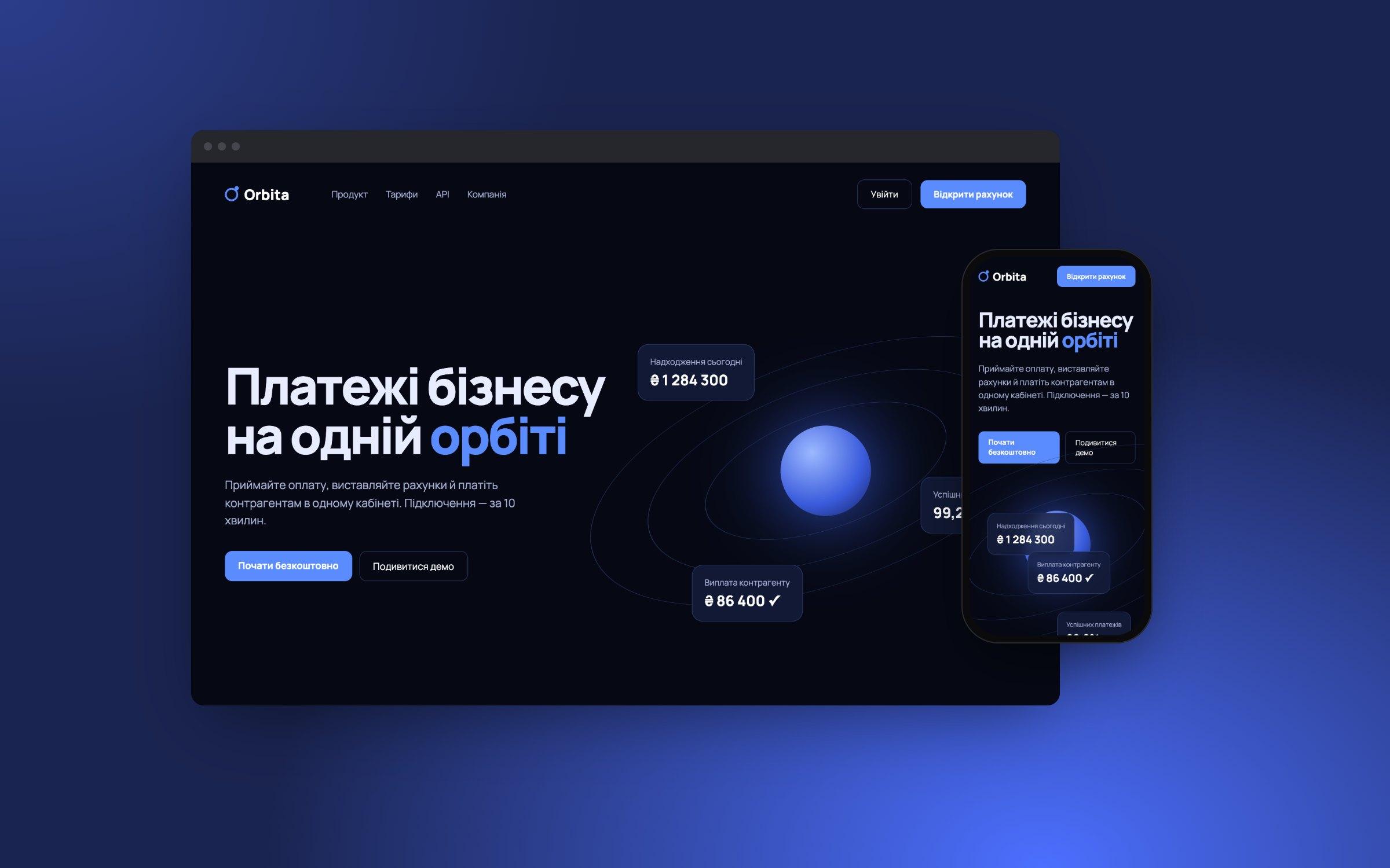
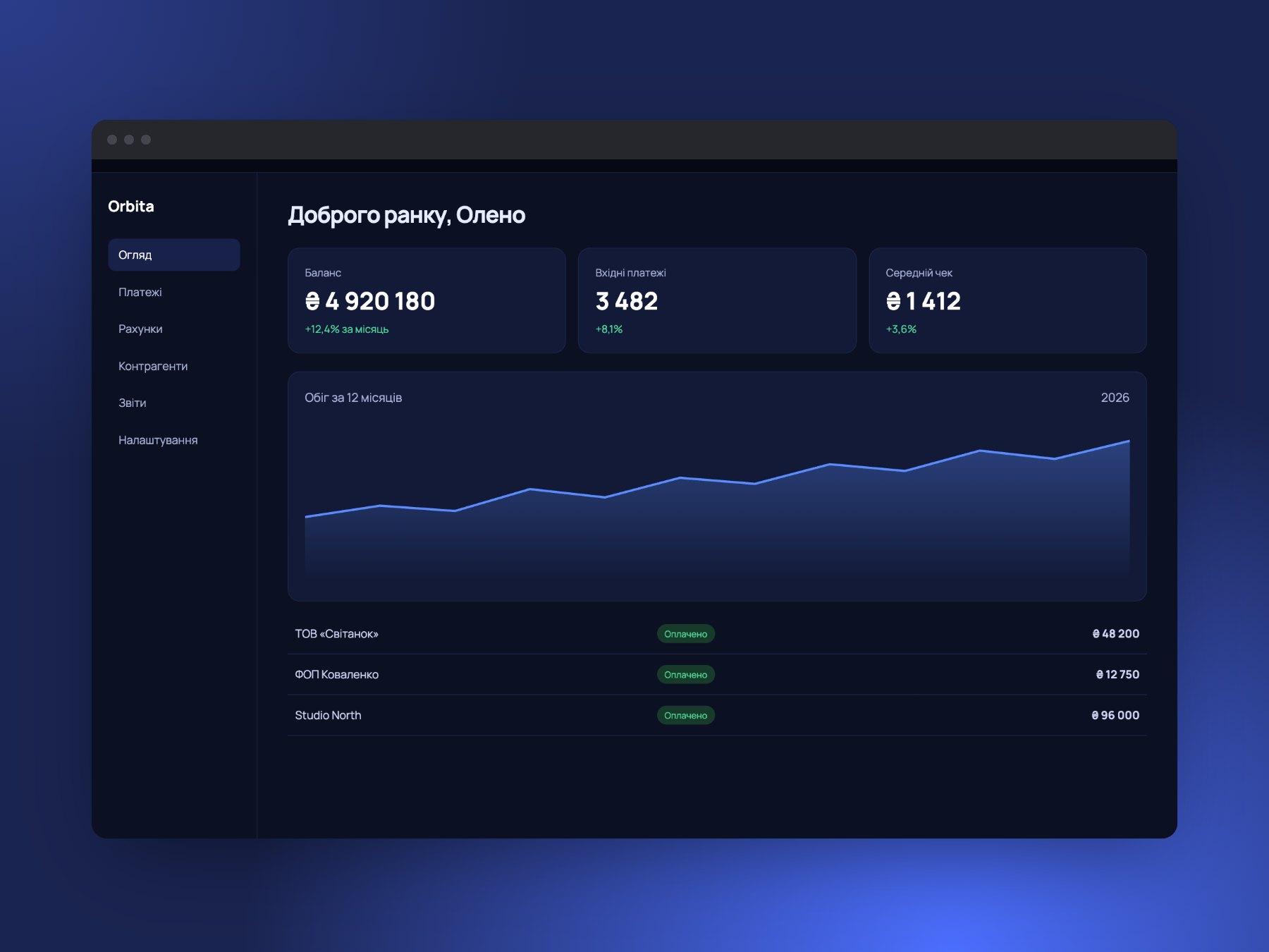
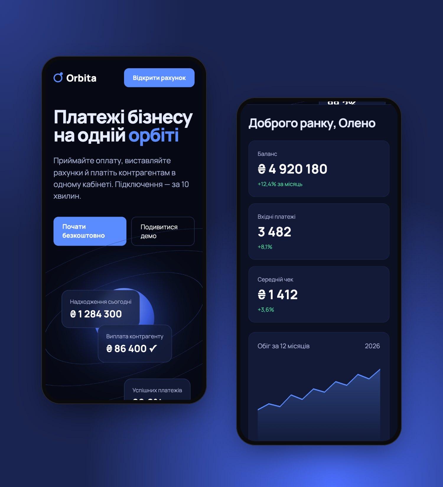
A product landing page and dashboard for a payments platform: a complex product explained in a single scroll.
Challenge
The service can do a lot but explained it in the language of bank paperwork. Visit-to-signup conversion was flat, and sales spent their time answering the same questions.
Solution
We built the story around one metaphor — the orbit of a payment. An animated diagram shows how money moves, and a 60-component design system ties the landing page and dashboard into one product.
Outcome
Sign-ups grew noticeably, and “how does it work” support tickets dropped. The design system sped up shipping new sections.
Results in numbers
- +38%
- sign-ups
- −27%
- support tickets
- 60+
- design system components
What we did
Technology